Thursday, May 12, 2011

Diving into Watercolor


Sixth grade artists spent some time practicing watercolor techniques and then we looked at two contemporary watercolor artists, Sherri Reeve and Pauline Walsh Jacobson. Their undersea paintings capture the luminosity and movement that make watercolor and ocean paintings go so well together. Students selected a favorite fish or creature to draw and then copied it onto tracing paper from which they could replicate many times on their watercolor paper. For interest, they might borrow a fish from a classmate to add to their undersea composition. Then, we added fine lines in white crayon to the background in order to give the water a sense of movement. We added a wet on wet wash to the water, then carefully painted our fish. Finally, we added splatters of paint using a pipette to add an underwater "bubbling" effect.

Wednesday, April 13, 2011

Just Desserts à la Wayne Thiebaud


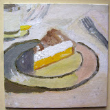
Everyone loves dessert! Sixth grade artists were introduced to the work of Wayne Thiebaud and his desserts a plenty. We chose a photo from a magazine of our favorite dessert and made 6x6" sketches that we transfered to 6x6" canvas. The students were encouraged to work slowly to build layers of acrylic paint, resulting in an impasto surface that mimicks real icing perfectly. YUMMY. Click on the lemon meringue to see more paintings:

Tuesday, April 5, 2011

Chuck Close, graphite and charcoal close ups


From Grid Self Portraits -ART I

Middle School self-portraits. The agony, the arguments, and sometimes surprised and pleased outcomes for students. Basing our lesson on the technical portraits of Chuck Close, students enlarged a black and white photograph to three times it's original size. Students worked one square at a time, allowing them to concentrate on values in each fragment rather than making the overall paper 'look good.'
Grid Self Portraits -ART I

Prismacolor Flowers for Beginning Art


Sixth grade art students are capable of amazing things. They are so willing to try and they soak up instruction like brilliant artistic sponges. For this project, each student selected a photo of a flower or plant, and then they made sketches of of image in their journals. Next, students practiced enlarging the image to twice its size while still keeping the same proportions and textures as the original. Finally, we transferred the image to colored Canson paper and after several Prismacolor training sessions, students began adding color to the images. The results are amazing and the beginning art students were very proud.
Prismacolor Flower Gallery

Thursday, December 10, 2009

Batik with paint and ink


BATIK~a method of decorating cloth by covering part of it with wax and then dyeing the cloth, is easily simplified in the art classroom with crayons and watercolor. In this project, we used chalk, acrylic paint, and india ink.
5th graders studied the art of batik and created animal designs in chalk on paper. Then, students painted their animals and added ink to their paintings, washing away the ink after only a few minutes to reveal their animal designs. We touched up areas where color was lost with oil pastels to create high-contrast designs.

Monday, December 7, 2009

Cityscape Collages


Third and Fourth grade students enjoyed looking at different photos of Tegucigalpa and comparing them to other cityscapes from around the world. We began our cityscapes by working in layers, from the top to the bottom of the paper. Students used torn paper to add sky and the distant hills that surround our city. We made sure that each of us was presenting our city and home in a "bird's eye view," so that we each had a clear horizon line in our work. We added buildings to the middle ground that we see in our community, and we added our home in the foreground.

Fall Trees


This lesson presents students with a challenge to create balance between positive and negative space in their composition. First, we cut up pieces of cardboard we had lying around. Then, students added torn strips of masking tape to create a tree-like design on their cardboard. We then sponge-painted fall colors on top of our tape and cardboard. The following class, we ripped off the tape to reveal a tree form and added white and black charcoal for highlights and shadows on our trees. Students were pleased to see how "realistic" their trees turned out.